


2,991 WORDS
11 MIN READ
[Dashboards]
[Data Visualisation]
[Power BI]
[Tableau]
Design Matters #11 - Borders & Shadows (Visual Analogies in Data Displays - Part II)

Hi Friends!
Welcome to issue #11 of the series Design Matters.
The goal of this series is to shed light on how Design plays an indispensable role in data analytics-not just in making things look pretty but in affecting understanding, communication, and decision-making.
That elusive modern design look
We’ve all been there: We put together a collection of charts on a screen, chose colours carefully, nailed the typography, and paid attention to placement and hierarchy of information, and then our beloved client/stakeholder says they think our data display is missing some abstract thing they can’t quite place.
Usually, they choose to name it with phonetic (but meaningless) words, such as “Oompf” or “Pop.”
“…but can’t you make it POP a bit more…?
Last month, I explored the history of User Interfaces (UI). We talked about skeuomorphism, how it came to be, and why. If you have missed it, I strongly recommend reading it before diving into this one, as it will help you understand where we’re coming from.
Look at your screen, and you’ll notice a series of visual analogies akin to an aerial top view of an office desk. You have a desk-top, a rubbish bin, and a pencil as your edit icon. Your save button is reminiscent of ancient technology, and so on.
One of the limitations of a virtual world, though, is its flatness. So, when we’re talking about familiarity and usability, we miss that real-world touch, that depth that natural materials have. We also often miss a clear division and understanding of place. Where does your app window end and the next app window begin? How do you flick through them?
If you look at your User Interface right now, you’ll notice it is mostly consistent across apps. You’ll also notice a take on making windows and apps behave like pieces of real-world materials, giving you a bit of physical feedback when you touch, drag, or overlap screens. They feel like post-its, pieces of paper, or pieces of fabric spread across a desk. You’ll also notice that there is a bit of layering going on. If you put one window on top of another, there will be a little bit of a cast shadow, indicating that things can overlap.
You’ll also notice that buttons look like buttons. You just know you can press on certain elements of the screen, and something will happen if you do. They likely feel a little bit raised from the flat surface on top of which they’re resting. Sometimes, they feel like they have some volume to them. Pressing them will likely give you an instant visual indication that, yes, indeed, this button was pressed.
All of these concepts are intentional. They have been refined and standardised by designers who sat down and thought this through carefully. Their work is now perceived as the golden standard for digital user interfaces. It is Google’s Material Design System, which was first introduced to the world 10 years ago, in 2014.
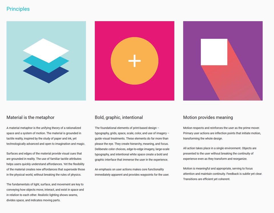
Material Design has evolved since it came to be. It is currently in its third iteration. Google maintains all of its design systems (and iterations) on one neat website, where you can look at their principles and fundamentals and learn a few things about what makes them work (and maybe even grab a tip or two on how to apply them to your dashboard development design). I highly recommend everyone to have a look.
Material Design versions:
Material Dashboard Design
So, back to making things “pop”. Upon hearing such feedback, you may have felt like designing a dashboard that is both functional and looks like the expectations of your stakeholders or clients is a bit of an unachievable goal.
You might have tried searching for dashboard design on places like Dribbble, Google or Behance, only to be bombarded by quite unrealistic depictions that either are not functional at all or were created with no data backing them up using unfamiliar tools.
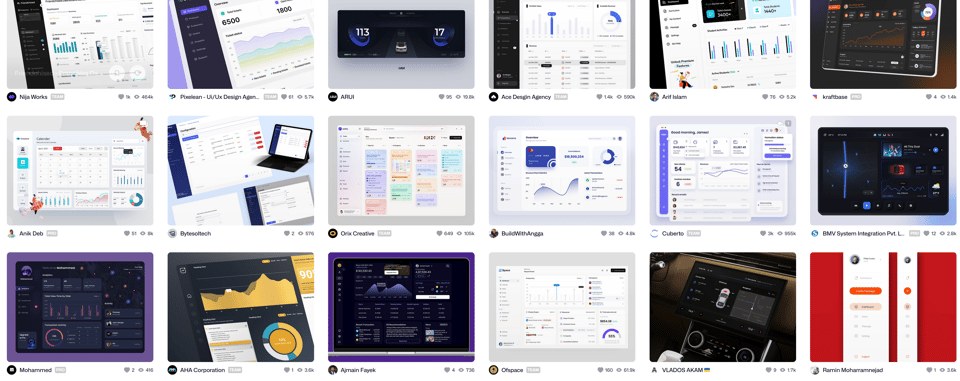
It feels like an uphill battle. You get angry and frustrated, and then you try your best to make things a bit more “oompf.” You realise that most of these seem to make use of rounded corners, drop shadows, and colourful backgrounds. Maybe that’s what your audience is referring to?
But try as you might, using what you have out-of-the-box in tools like Tableau or Power BI only gets you so far. You end up with something that looks like this:
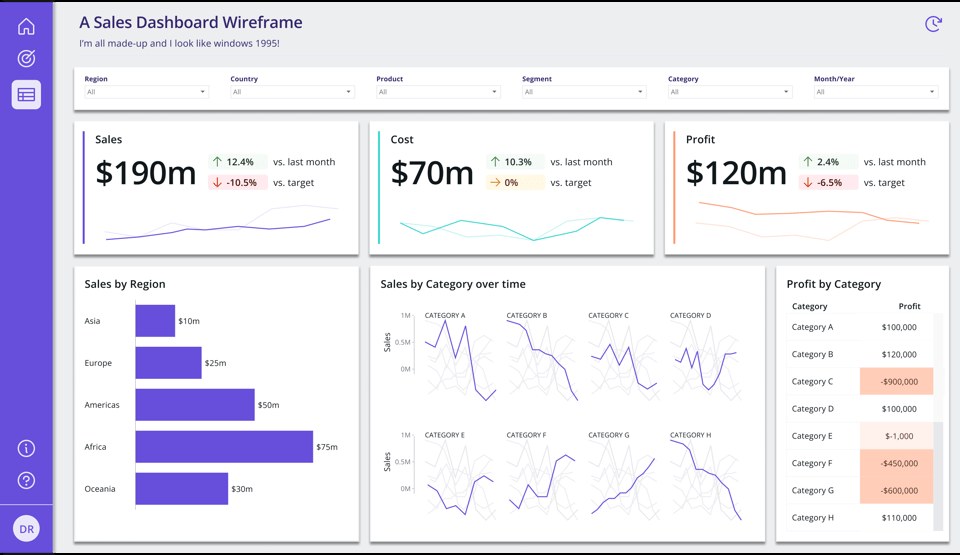
It does have that Windows 1995 vibe. Maybe it’s the grey background? You’re not sure…
Also, you might be starting to wonder if this is at all relevant or just eye candy. Didn’t Tufte name this ?
Let’s unpack this.
Gestalt principles: Proximity & Enclosure
You might have heard of Gestalt Principles before. They are a series of cognitive perception laws that designers all over the world have adopted to inform design decisions, especially when it comes to layout and information cognition. There are multiple principles, but for today’s article, we’ll explore two of them: Proximity and Enclosure.
Proximity’s Law postulates that:
“Elements arranged close to each other are perceived as more related than those placed further apart.”
This means that elements that are close together are often perceived as part of the same group rather than separate entities.
Take the image below, for example. It is hard to distinguish if there are groups of shapes we should consider together or not.

But if we decide to create white space areas in between groups of elements, we now see three distinct groups of shapes and we also now perceive them as part of different groups.
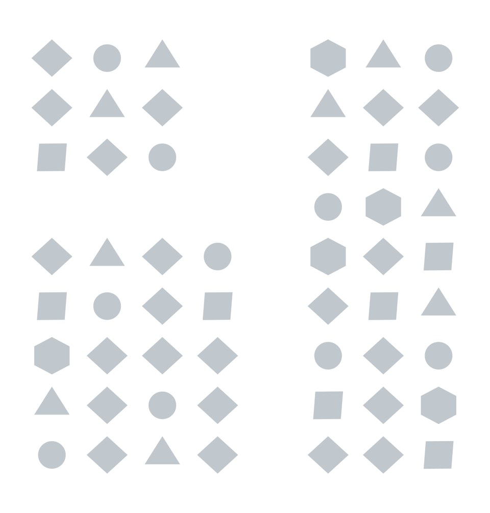
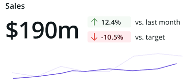
This is what Proximity does, and it is often the main principle we see being used when we talk about dashboard design. For example, when we create little areas for KPIs, where we bundle indicators together, close to trendlines and big numbers.
By proximity, we associate that we should consider all these separate elements as part of one big design element and that the parts should be interpreted and decoded together.
However, we could also use Gestalt’s Law of Enclosure for a similar effect.
Enclosure’s Law postulates that:
“Objects collected within a boundary-like structure are perceived as a group.”
So, if we look at our original diagram, we could argue that this would also help us perceive three different groups of shapes:
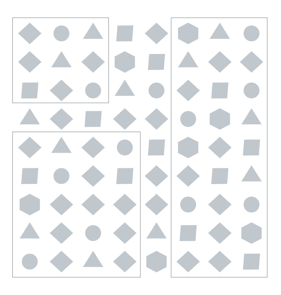
When creating dashboards, this can translate to us choosing to have less white space between elements but adding borders so that we mark them as a group instead:

But the risk here is when we decide it’s a good idea to do this all over the place. Because both Proximity and Enclosure also shift our perception of hierarchy on a page.
Consider white space and borders as the punctuation you use in sentences when writing. When you group elements and add a barrier of any kind between one group and another, your brain makes a pause. Then, it picks it back up after the pause for the next group.
So, our dashboard above suffers from this excess: each block commands us to consider it separately, and the flow is choppy. We have to stop and think a little bit to know if the purple bar chart is related to the KPI above it, which is also painted in purple. They are two separate groups now, even though the colours tell me they should be the same. The reading becomes confusing.
One strategy we can employ is to always define hierarchy first and then group our elements based on the order we want our audience’s eyes to follow on the page. We can do that by considering the three principles we have learned across this and previous Design Matters issues: Position, Proximity and Enclosure.
Let’s see how this would work here with our diagrams first.
If we’re to position our hierarchy, we’d say we first want our readers to see their main KPI groups. So we place them at the top of the page. Next, we place charts, and later at the bottom other details we might have (like a big table or a footer)

We might feel a strange urge to enclose each of these elements and make them very obviously different groups.

But we also realise that now everything looks so much busier than before! It becomes hard to know what’s more important, even though we positioned things clearly.
Maybe if we colour the background instead? And use the enclosure principle with something other than borders?
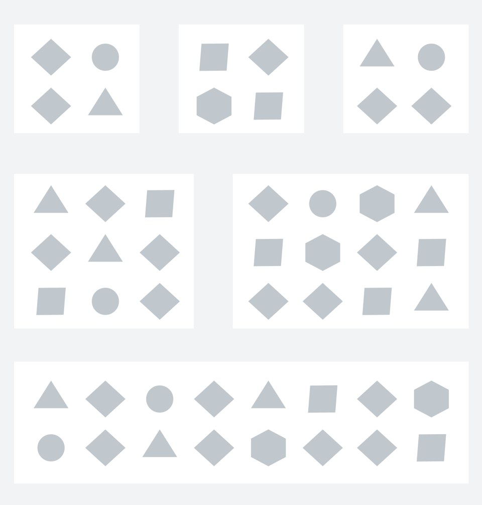
Hum… better, but not quite.
This does look like old-timey interfaces, and I want that modern Material Design look we talked about before! Can I do Enclosure using shadows instead? And what about round corners?
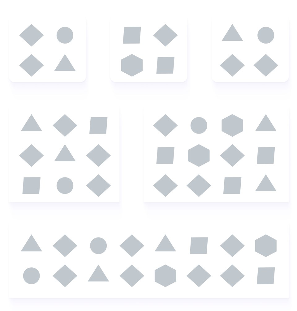
Ohhh, shiny! I like it! But I still have somewhat the same issue: where should I look first?
So, if I want people to first look at the groups at the top, then look at the middle and then see that the bottom part is not part of the elements above but something apart… could I combine all of these things and have them work together for the purpose of reinforcing hierarchy, instead of messing with it?
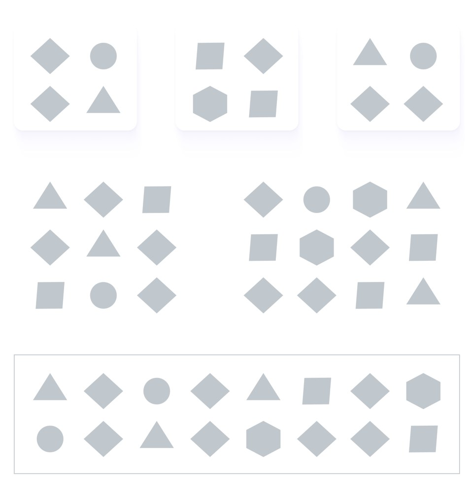
I think we’re onto something here.
Now I see I have one bigger group that seems to be more relevant at the top; this group is made of three smaller subgroups. Then comes the middle area, which is obviously distinct from the bottom area. I might even choose to look at the bottom area first because the border gives it emphasis.
So, speaking of emphasis, could I use enclosure to then highlight a small section of the bottom group?
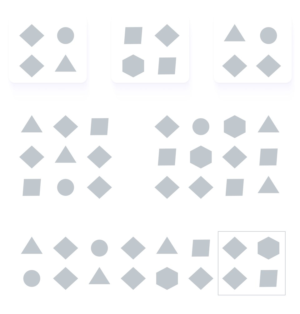
I see! What other ways could I combine these strategies? Perhaps the top section could be just one big group, raised a bit from the others:
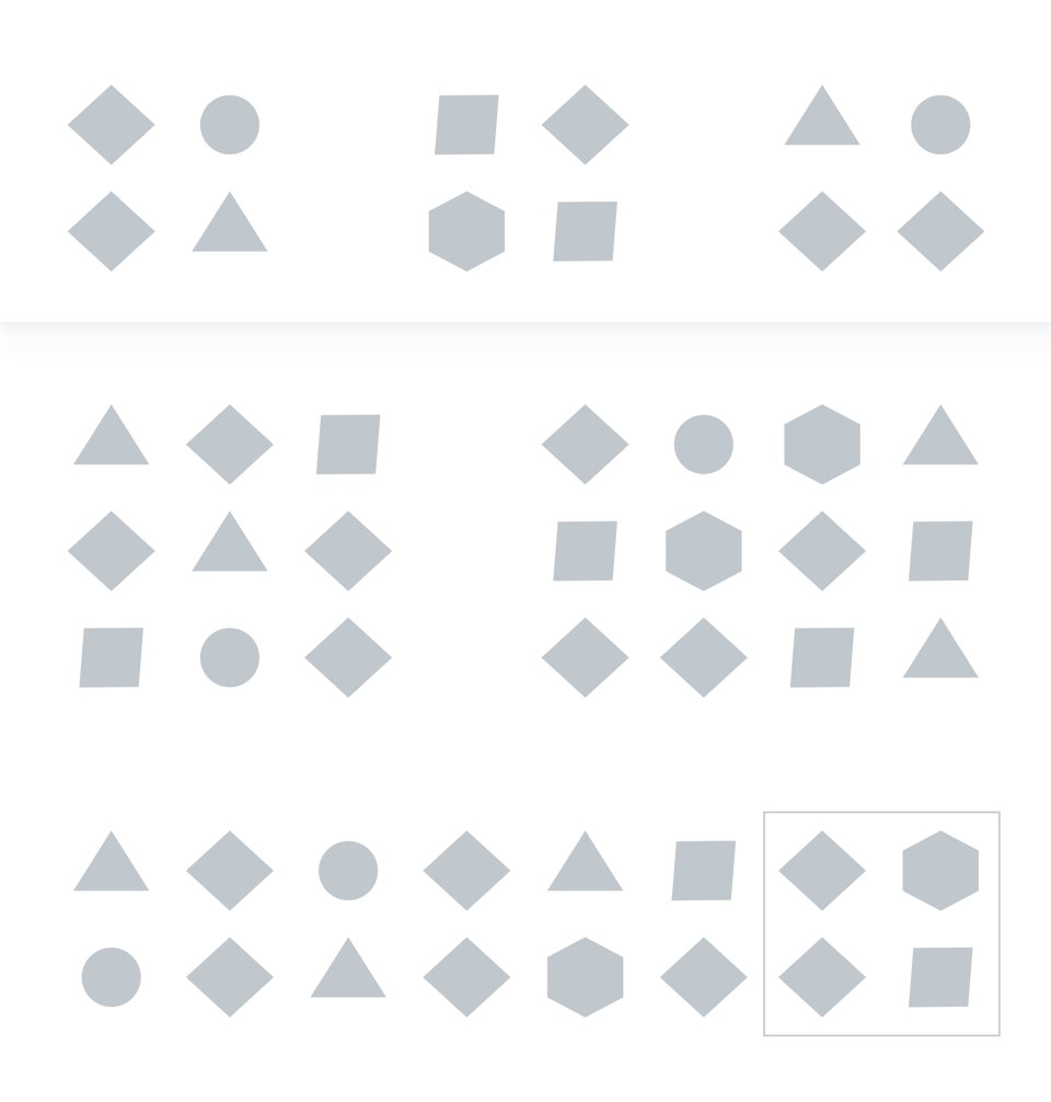
And now that I nailed hierarchy first, can I make it look softer, more friendly and modern?
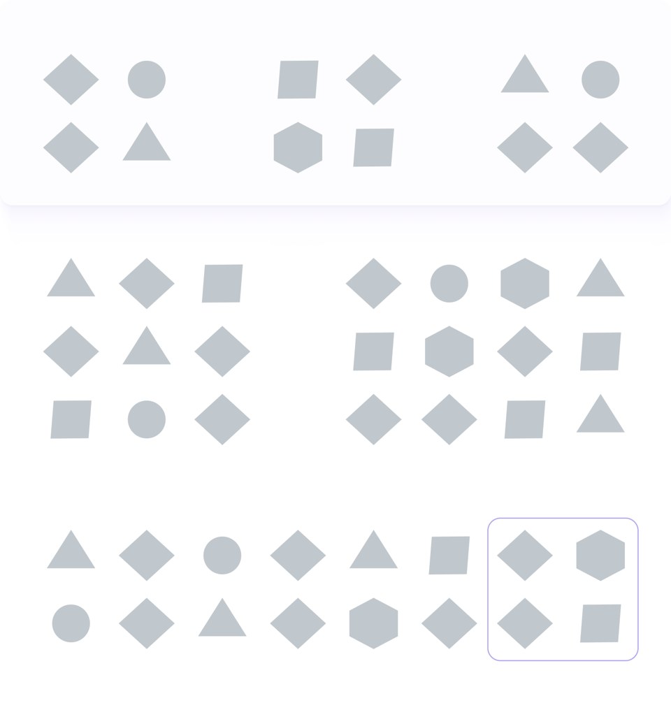
As we can see above, we can make layout effects work for our designs and reinforce our hierarchy and functionality. We also don’t need to sacrifice a little bit of flair to do so. It is the intention that makes the difference.
A brief note about drop shadows
Native BI tool drop-shadows suck. They really do. If your tool manages to have a drop shadow option, the defaults are just… bad.
The idea behind using shadows is to replicate overlap and layering. This means that good shadows are hard to make unless you understand a bit about lighting, direction and how to replicate the effect consistently.
We don’t have to use drop shadows to make an interface look modern. Round borders, a bit of wise colouring and your designs will already be a lot better.
But if you really want to take them up a notch and use shadows, use them wisely. Here are a few things to consider:

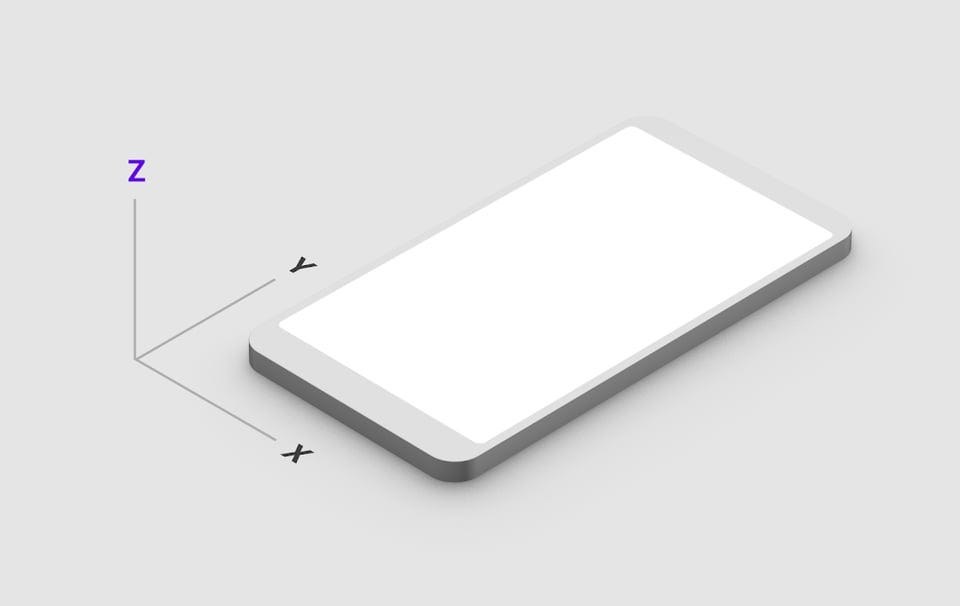
Realistic shadows are softer. Your standard shadow option will usually be too harsh and muddy. Make sure you adjust the intensity of the colour (more transparency) and the softness with which it spreads. No harsh lines are best.
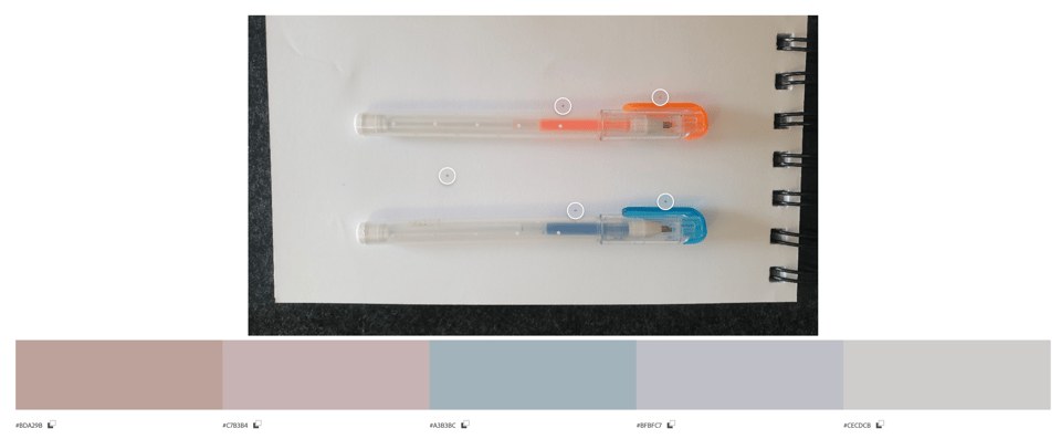
In terms of colour, not all shadows are grey. If you want that modern effect, remember to either pick a grey shade that has a tint of your primary colour in it or to add multiple shadow layers, in which the closest one to the object being shaded is your primary colour. This will make it feel fresher and avoid that dirty look we sometimes see.
Note the picture below. Two pens of different colours are exposed to the same source of light on top of a piece of white paper. Their shadows are not the same colour.
Putting it all together
Remember our dashboard from the beginning?
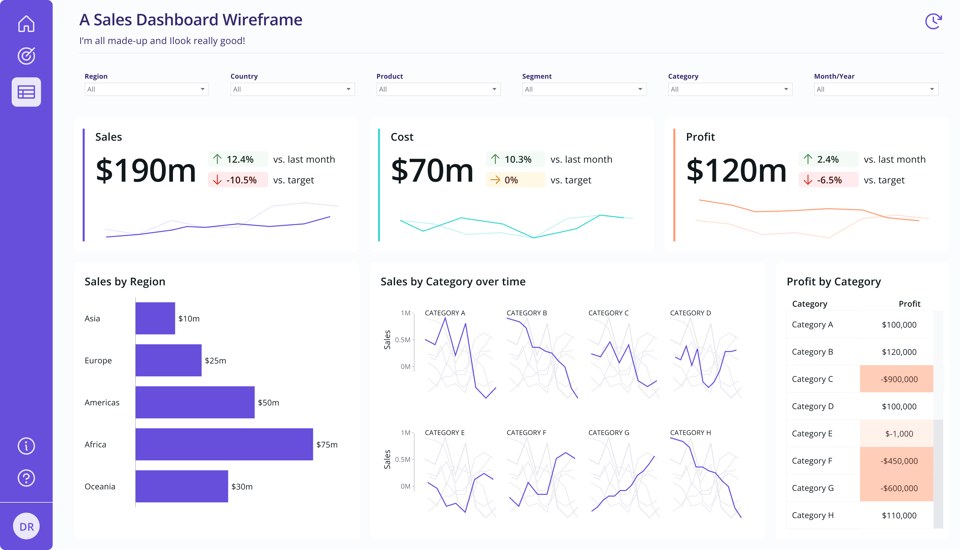
If we combine everything we discussed here for that particular layout, here’s what it would look like.
Looking at it, we have three different layers of reinforcement of our closure principle: The background contrast, borders and shadows. We don’t need all of these together. Let’s start by removing the background colour.
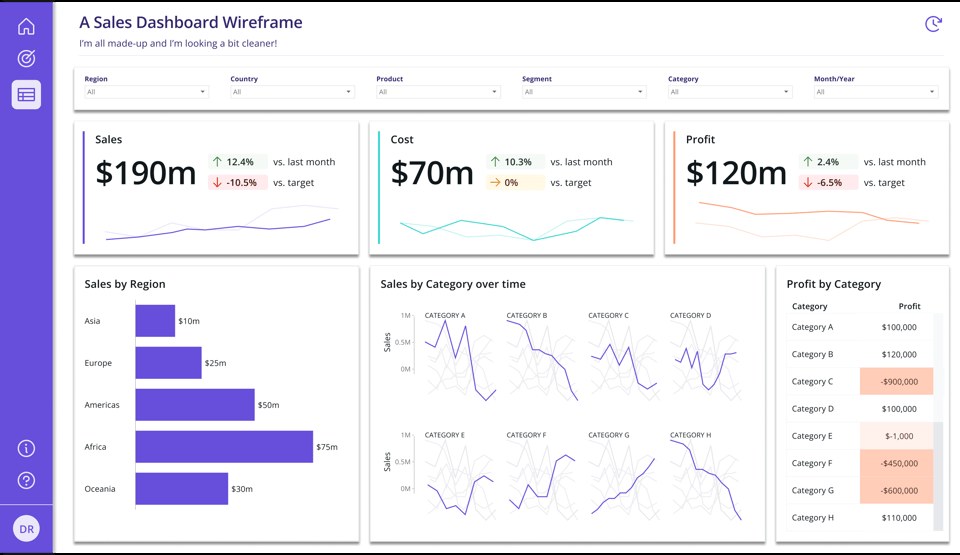
It already looks a bit cleaner. Let’s try to soften it a little more. The shadows are very dark, and if shadows define the areas, we don’t need borders.
Let’s keep the shadows and make them a slightly lighter shade.
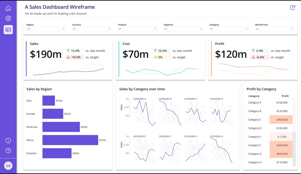
Diving into the details now. Notice how every element has the same highlight with shadows. This includes the filters pane. But I don’t want the filters pane to have the same hierarchical importance as the KPIs underneath it. I’ll remove the drop shadow from the filters section at the top.

I’ll also round the edges of the cards to make them feel a bit more modern and friendly.

Notice that we’re still using default shadows here. The only change we made was to lighten the default grey a bit. If your tool of choice doesn’t allow you to have a lot of control over what the shadows look like, you can still make it work for your interface, with a bit of thoughtful and intentional use.
Taking it an extra notch up again, we’ll fine-tune the shadow colours a bit.
I’ll also remove the shadows from the visuals at the bottom and leave them only for the KPIs. Not everything has the same level of importance, and I want to make sure people pay attention to the KPIs first.
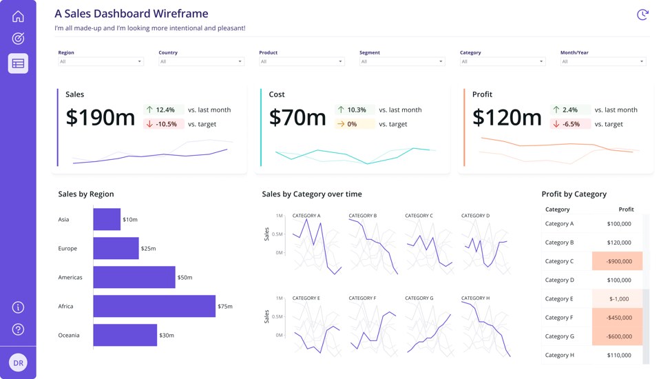

Now, I’ll say I am satisfied with the look of this. But some of you might be wondering what other options would look like. So, let’s explore.
Here’s the same design, with a very light purple hue added as background, to enclose the bottom cards a little bit — in case you’re missing a bit more structure:
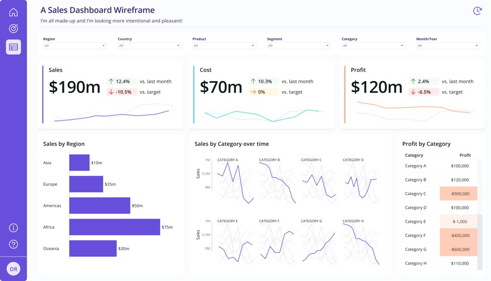
Notice the filters pane? It is white. We can take that back a bit by making it the same colour as the new background.
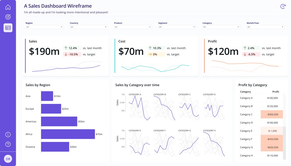
And what if I intensify the shadows ever so slightly?
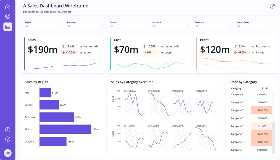
But at the end of the day, if your tool of choice doesn’t allow you to do this without significant workarounds, you don’t have to.
Here’s the same design, but with no drop shadows, only white cards, and a slight colour added to the background to mark their position a bit better.
Also, note that the background is a light shade of the primary colour instead of grey — this makes it feel modern, simple, clean, fresh and avoids that muddy look we had initially.
How do I make this in [insert BI tool name here]
As I said above, often, you’ll have to go through some workarounds.
The easiest and most effective way is to use a tool like Figma to create a background image. Figma makes creating drop shadows and other elements like this a breeze, and you’ll also have the bonus of being able to plan the placement of your content using the background before you load it into your tool.
Another option you can use-although less versatile-is Canva. Avoid PowerPoint or Paint, as they’ll likely lead you to one of the many pitfalls I mentioned above.
If you don’t want to mess with design tools, as I said before — you don’t have to. If you shift the focus from “add these elements to make it look good” to “how can I use these visual analogies to enhance my user’s experience when using this interface?” you’ll notice an instant revamp on your designs. No hacks needed.
Learn more:
I left out a ton of interesting resources I found while researching this topic. So here they are, in case you want to learn more:
If you like what I share, you can support my caffeinated habits.
Until next time,
— T.
*This is a repost of the Design Matters series I run as part of my newsletter, originally sent to my subscribers on *08 March 2024.
2,991 WORDS
11 MIN READ
[Dashboards]
[Data Visualisation]
[Power BI]
[Tableau]
Design Matters #11 - Borders & Shadows (Visual Analogies in Data Displays - Part II)
Hi Friends!
Welcome to issue #11 of the series Design Matters.
The goal of this series is to shed light on how Design plays an indispensable role in data analytics-not just in making things look pretty but in affecting understanding, communication, and decision-making.
That elusive modern design look
We’ve all been there: We put together a collection of charts on a screen, chose colours carefully, nailed the typography, and paid attention to placement and hierarchy of information, and then our beloved client/stakeholder says they think our data display is missing some abstract thing they can’t quite place.
Usually, they choose to name it with phonetic (but meaningless) words, such as “Oompf” or “Pop.”
“…but can’t you make it POP a bit more…?
Last month, I explored the history of User Interfaces (UI). We talked about skeuomorphism, how it came to be, and why. If you have missed it, I strongly recommend reading it before diving into this one, as it will help you understand where we’re coming from.
Look at your screen, and you’ll notice a series of visual analogies akin to an aerial top view of an office desk. You have a desk-top, a rubbish bin, and a pencil as your edit icon. Your save button is reminiscent of ancient technology, and so on.
One of the limitations of a virtual world, though, is its flatness. So, when we’re talking about familiarity and usability, we miss that real-world touch, that depth that natural materials have. We also often miss a clear division and understanding of place. Where does your app window end and the next app window begin? How do you flick through them?
If you look at your User Interface right now, you’ll notice it is mostly consistent across apps. You’ll also notice a take on making windows and apps behave like pieces of real-world materials, giving you a bit of physical feedback when you touch, drag, or overlap screens. They feel like post-its, pieces of paper, or pieces of fabric spread across a desk. You’ll also notice that there is a bit of layering going on. If you put one window on top of another, there will be a little bit of a cast shadow, indicating that things can overlap.
You’ll also notice that buttons look like buttons. You just know you can press on certain elements of the screen, and something will happen if you do. They likely feel a little bit raised from the flat surface on top of which they’re resting. Sometimes, they feel like they have some volume to them. Pressing them will likely give you an instant visual indication that, yes, indeed, this button was pressed.
All of these concepts are intentional. They have been refined and standardised by designers who sat down and thought this through carefully. Their work is now perceived as the golden standard for digital user interfaces. It is Google’s Material Design System, which was first introduced to the world 10 years ago, in 2014.
Material Design has evolved since it came to be. It is currently in its third iteration. Google maintains all of its design systems (and iterations) on one neat website, where you can look at their principles and fundamentals and learn a few things about what makes them work (and maybe even grab a tip or two on how to apply them to your dashboard development design). I highly recommend everyone to have a look.
Material Design versions:
Material Dashboard Design
So, back to making things “pop”. Upon hearing such feedback, you may have felt like designing a dashboard that is both functional and looks like the expectations of your stakeholders or clients is a bit of an unachievable goal.
You might have tried searching for dashboard design on places like Dribbble, Google or Behance, only to be bombarded by quite unrealistic depictions that either are not functional at all or were created with no data backing them up using unfamiliar tools.
It feels like an uphill battle. You get angry and frustrated, and then you try your best to make things a bit more “oompf.” You realise that most of these seem to make use of rounded corners, drop shadows, and colourful backgrounds. Maybe that’s what your audience is referring to?
But try as you might, using what you have out-of-the-box in tools like Tableau or Power BI only gets you so far. You end up with something that looks like this:
It does have that Windows 1995 vibe. Maybe it’s the grey background? You’re not sure…
Also, you might be starting to wonder if this is at all relevant or just eye candy. Didn’t Tufte name this ?
Let’s unpack this.
Gestalt principles: Proximity & Enclosure
You might have heard of Gestalt Principles before. They are a series of cognitive perception laws that designers all over the world have adopted to inform design decisions, especially when it comes to layout and information cognition. There are multiple principles, but for today’s article, we’ll explore two of them: Proximity and Enclosure.
Proximity’s Law postulates that:
“Elements arranged close to each other are perceived as more related than those placed further apart.”
This means that elements that are close together are often perceived as part of the same group rather than separate entities.
Take the image below, for example. It is hard to distinguish if there are groups of shapes we should consider together or not.
But if we decide to create white space areas in between groups of elements, we now see three distinct groups of shapes and we also now perceive them as part of different groups.
This is what Proximity does, and it is often the main principle we see being used when we talk about dashboard design. For example, when we create little areas for KPIs, where we bundle indicators together, close to trendlines and big numbers.
By proximity, we associate that we should consider all these separate elements as part of one big design element and that the parts should be interpreted and decoded together.
However, we could also use Gestalt’s Law of Enclosure for a similar effect.
Enclosure’s Law postulates that:
“Objects collected within a boundary-like structure are perceived as a group.”
So, if we look at our original diagram, we could argue that this would also help us perceive three different groups of shapes:
When creating dashboards, this can translate to us choosing to have less white space between elements but adding borders so that we mark them as a group instead:
But the risk here is when we decide it’s a good idea to do this all over the place. Because both Proximity and Enclosure also shift our perception of hierarchy on a page.
Consider white space and borders as the punctuation you use in sentences when writing. When you group elements and add a barrier of any kind between one group and another, your brain makes a pause. Then, it picks it back up after the pause for the next group.
So, our dashboard above suffers from this excess: each block commands us to consider it separately, and the flow is choppy. We have to stop and think a little bit to know if the purple bar chart is related to the KPI above it, which is also painted in purple. They are two separate groups now, even though the colours tell me they should be the same. The reading becomes confusing.
One strategy we can employ is to always define hierarchy first and then group our elements based on the order we want our audience’s eyes to follow on the page. We can do that by considering the three principles we have learned across this and previous Design Matters issues: Position, Proximity and Enclosure.
Let’s see how this would work here with our diagrams first.
If we’re to position our hierarchy, we’d say we first want our readers to see their main KPI groups. So we place them at the top of the page. Next, we place charts, and later at the bottom other details we might have (like a big table or a footer)
We might feel a strange urge to enclose each of these elements and make them very obviously different groups.
But we also realise that now everything looks so much busier than before! It becomes hard to know what’s more important, even though we positioned things clearly.
Maybe if we colour the background instead? And use the enclosure principle with something other than borders?
Hum… better, but not quite.
This does look like old-timey interfaces, and I want that modern Material Design look we talked about before! Can I do Enclosure using shadows instead? And what about round corners?
Ohhh, shiny! I like it! But I still have somewhat the same issue: where should I look first?
So, if I want people to first look at the groups at the top, then look at the middle and then see that the bottom part is not part of the elements above but something apart… could I combine all of these things and have them work together for the purpose of reinforcing hierarchy, instead of messing with it?
I think we’re onto something here.
Now I see I have one bigger group that seems to be more relevant at the top; this group is made of three smaller subgroups. Then comes the middle area, which is obviously distinct from the bottom area. I might even choose to look at the bottom area first because the border gives it emphasis.
So, speaking of emphasis, could I use enclosure to then highlight a small section of the bottom group?
I see! What other ways could I combine these strategies? Perhaps the top section could be just one big group, raised a bit from the others:
And now that I nailed hierarchy first, can I make it look softer, more friendly and modern?
As we can see above, we can make layout effects work for our designs and reinforce our hierarchy and functionality. We also don’t need to sacrifice a little bit of flair to do so. It is the intention that makes the difference.
A brief note about drop shadows
Native BI tool drop-shadows suck. They really do. If your tool manages to have a drop shadow option, the defaults are just… bad.
The idea behind using shadows is to replicate overlap and layering. This means that good shadows are hard to make unless you understand a bit about lighting, direction and how to replicate the effect consistently.
We don’t have to use drop shadows to make an interface look modern. Round borders, a bit of wise colouring and your designs will already be a lot better.
But if you really want to take them up a notch and use shadows, use them wisely. Here are a few things to consider:
Realistic shadows are softer. Your standard shadow option will usually be too harsh and muddy. Make sure you adjust the intensity of the colour (more transparency) and the softness with which it spreads. No harsh lines are best.
In terms of colour, not all shadows are grey. If you want that modern effect, remember to either pick a grey shade that has a tint of your primary colour in it or to add multiple shadow layers, in which the closest one to the object being shaded is your primary colour. This will make it feel fresher and avoid that dirty look we sometimes see.
Note the picture below. Two pens of different colours are exposed to the same source of light on top of a piece of white paper. Their shadows are not the same colour.
Putting it all together
Remember our dashboard from the beginning?
If we combine everything we discussed here for that particular layout, here’s what it would look like.
Looking at it, we have three different layers of reinforcement of our closure principle: The background contrast, borders and shadows. We don’t need all of these together. Let’s start by removing the background colour.
It already looks a bit cleaner. Let’s try to soften it a little more. The shadows are very dark, and if shadows define the areas, we don’t need borders.
Let’s keep the shadows and make them a slightly lighter shade.
Diving into the details now. Notice how every element has the same highlight with shadows. This includes the filters pane. But I don’t want the filters pane to have the same hierarchical importance as the KPIs underneath it. I’ll remove the drop shadow from the filters section at the top.
I’ll also round the edges of the cards to make them feel a bit more modern and friendly.
Notice that we’re still using default shadows here. The only change we made was to lighten the default grey a bit. If your tool of choice doesn’t allow you to have a lot of control over what the shadows look like, you can still make it work for your interface, with a bit of thoughtful and intentional use.
Taking it an extra notch up again, we’ll fine-tune the shadow colours a bit.
I’ll also remove the shadows from the visuals at the bottom and leave them only for the KPIs. Not everything has the same level of importance, and I want to make sure people pay attention to the KPIs first.
Now, I’ll say I am satisfied with the look of this. But some of you might be wondering what other options would look like. So, let’s explore.
Here’s the same design, with a very light purple hue added as background, to enclose the bottom cards a little bit — in case you’re missing a bit more structure:
Notice the filters pane? It is white. We can take that back a bit by making it the same colour as the new background.
And what if I intensify the shadows ever so slightly?
But at the end of the day, if your tool of choice doesn’t allow you to do this without significant workarounds, you don’t have to.
Here’s the same design, but with no drop shadows, only white cards, and a slight colour added to the background to mark their position a bit better.
Also, note that the background is a light shade of the primary colour instead of grey — this makes it feel modern, simple, clean, fresh and avoids that muddy look we had initially.
How do I make this in [insert BI tool name here]
As I said above, often, you’ll have to go through some workarounds.
The easiest and most effective way is to use a tool like Figma to create a background image. Figma makes creating drop shadows and other elements like this a breeze, and you’ll also have the bonus of being able to plan the placement of your content using the background before you load it into your tool.
Another option you can use-although less versatile-is Canva. Avoid PowerPoint or Paint, as they’ll likely lead you to one of the many pitfalls I mentioned above.
If you don’t want to mess with design tools, as I said before — you don’t have to. If you shift the focus from “add these elements to make it look good” to “how can I use these visual analogies to enhance my user’s experience when using this interface?” you’ll notice an instant revamp on your designs. No hacks needed.
Learn more:
I left out a ton of interesting resources I found while researching this topic. So here they are, in case you want to learn more:
If you like what I share, you can support my caffeinated habits.
Until next time,
— T.
*This is a repost of the Design Matters series I run as part of my newsletter, originally sent to my subscribers on *08 March 2024.