2023 - The Year I wrote
In 2023 I started writing content online. Between social media posts, blog, Medium, and the (Dataviz) Design Matters newsletter, I wrote a lot!
This is a little visual reflection on what that journey looked like.
Year
2023
Type
Personal Project
Category
Information Design
Tools
Illustrator, Flourish
Client
Data Rocks
Services
Learning, Business Review, Fun
It all starts with an idea, and the idea was to understand how much I had written in one year.
To do that, I downloaded all of my blog posts, Medium posts, Newsletter posts and Social Media posts, and tried to understand what it all looked like.
The most obvious metric that comes to mind is number of words written. So, naturally, the first iteration with the combined dataset of all my writing in 2023 was a bar chart with the number of words written per month.
But that's now why I make personal projects! Boring bar charts are my bread and butter, of course. But if I am doing a dataviz for myself, I want to try something new!
So, try something new I went. What if I could use the idea of a typewriter to make a chart? What would a typewriter shaped chart even look like? Should I go minimal and make it all with just typed letters? Should I make a fun collage with a chart on top?
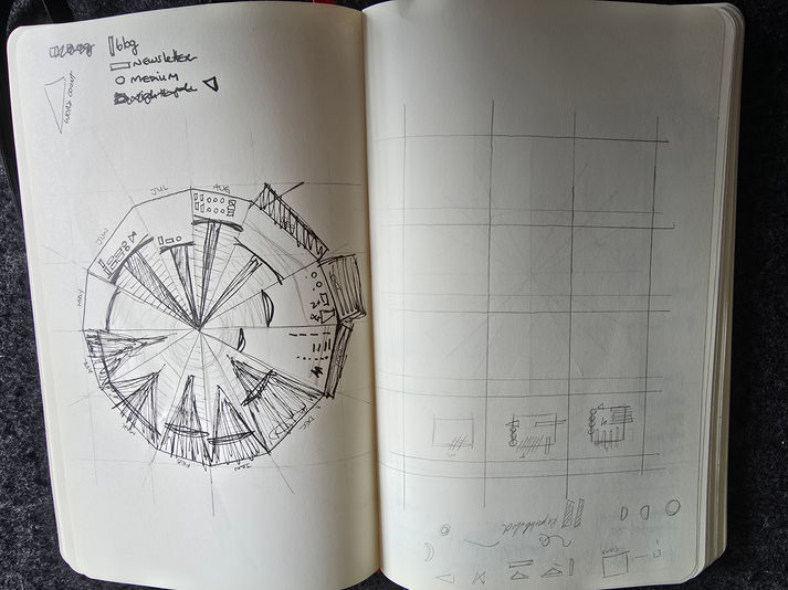
The initial thought was a typewriter, but after seeing a bar chart by month I also explored the potential idea of calendar shapes. How could I show what I did over a year? Should I focus just on writing? Could I add other elements?
Exploring these ideas was a lot of fun.
Here you can see some of the thinking behind that.
Once I had established I wanted to explore a round shape, I brought the word count per month bar chart, created using Flourish and exported as an SVG file, into Illustrator. I then made it go around an axis, and did not like the result. I tried ideating a bit more to see if it could work. I also explored options of adding extra layers of information as abstract shapes (like I did before in my dataviz self-portrait).
But I still wanted it to have at least a nudge to the fact that I wrote A LOT in 2023. The typewriter analogy kept nagging me.
So, I decided to follow the shape of a picture of a typewriter I found online. According to the Typewriter Database (yeah, it is a thing!), it is a 1898 Commercial Visible 6. It truly is a gorgeous machine. I then adjusted the curve of my bar chart to match the curvature of the typewriter. The length of the bars served as the arms which sustain the keys. Adding faint gridlines gave it a bit more structure in the way of looking like a typewriter of sorts, while also keeping a shape that lends itself nicely for a time series.
The first iteration was still a bit weird, though, as Illustrator tends to distort the bars when you bend the axis into a round shape, making them flare the ends. So, I decided to reshape the bars, and make them look like proper rectangular bars instead, which fits more nicely with the original shape of the typewriter used as reference.
From there, I decided to keep going with the analogy and instead of playing with abstract shapes, I identified each category of writing with typewriter letters. It felt like the right thing to do! The typeface used is P22 Typewriter Regular.
The little legend was also fun to do. Once the chart was ready, I shrinked it, removed most of the bars, keeping just the longest one, and painted it all a dark grey. It is not every day that I get to create a fun little different legend, and this is one of my favourites.
You might be wondering why the colour palette and the reason is mostly silly. The background colours were chosen because of Data Rocks branding. The chart though, is because I really like the old-timey feel I got on paper using markers to mockup the ideas for the main chart. I ended up with a nice palette that fits both the look and feel of the brand, as well as the typewriter's style.
The entire project took a couple of days to create, with the longest amount spent downloading data and arranging all of it to count words. Once that was done, the second day was pure fun ideating, exploring, and creating - the best part of data visualisation, if you ask me.


